Have you ever asked the users what they would like?
You probably have, but the wishes were so overwhelming that you concluded that it was out of your reach - both economically and technologically - and consequently, you have avoided speaking about it again.
Martin Hecht Olsen, CEO
Published Tue 2 Jan 2024
If you can't recognize this - I assure you that most application developers and project managers can.
Nevertheless, read this article or watch this video- it might ease your conscience and give the users what they have been asking for for years. Try Sitemule Model Studio
If you asked the users how they would like to access data and how the data should be presented. They probably would say something like this:
I would prefer to search for any data, partial data, or any combination of data.
It should be possible to arrange the columns to fit my needs for a given task – including adding or removing columns - and if I don't finish my task today, I expect the application to remember my setup till the next time I use it.
By sorting, filtering, and grouping, I should be able to get deeper visual insights and even answers to my questions about the data.
I would feel more comfortable if it were like a spreadsheet, and of course, at any time, I should be able to export the data I'm working on to a wide range of formats.
All of the above can be accomplished with Model Studio in Sitemule Architect. Before explaining how it's done, I will describe how data are accessed, presented, and maintained.
Portfolio presents the applications
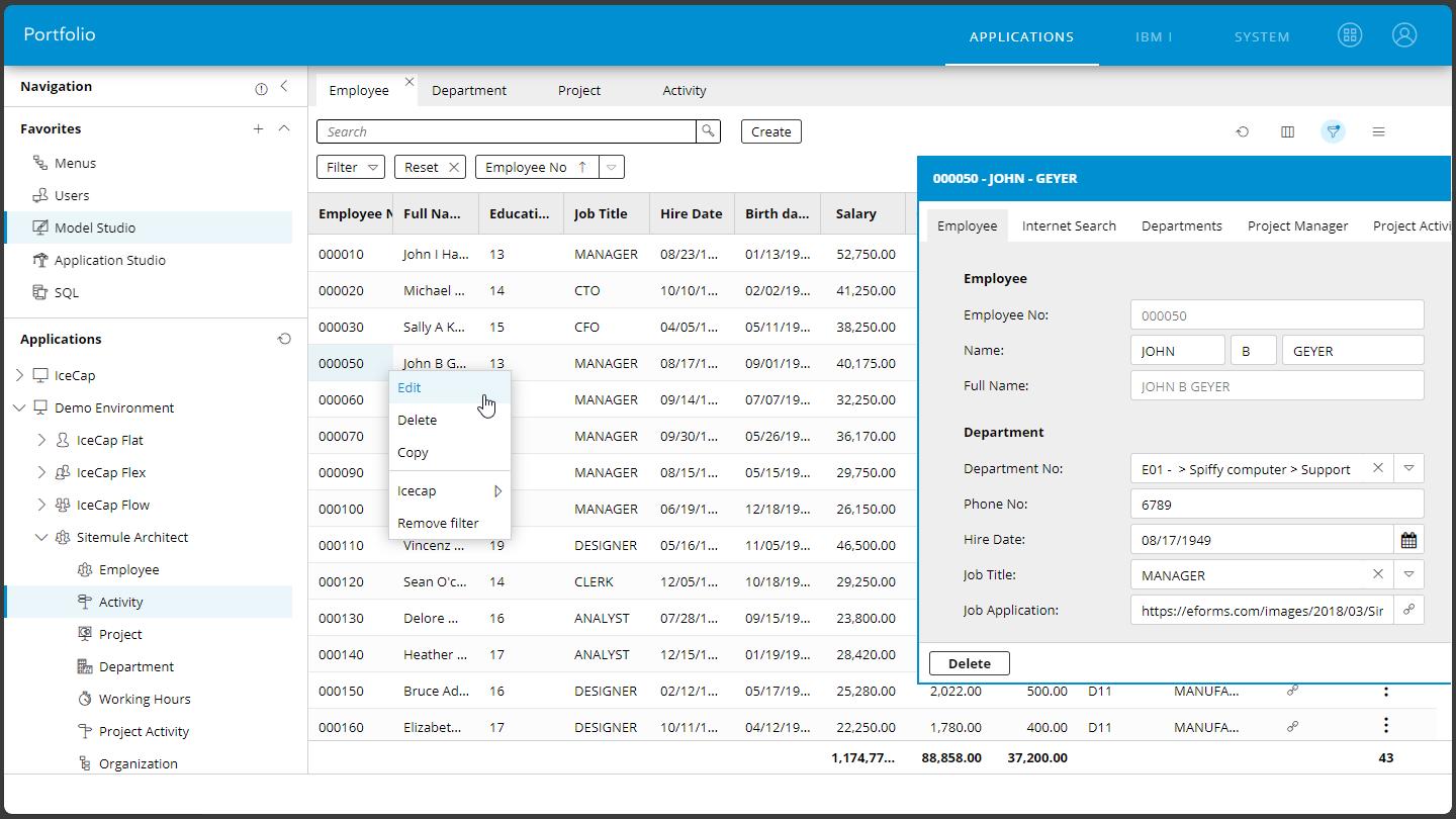
After logging on to Portfolio, the user is presented with all the accessible applications. The applications can be divided into different systems and organized further into tree structures, making it easy to locate desired applications.
Transform you ERP Solution now.
Presenting data
There are three ways to present data:
Lists
Forms
Tree Structures
These formats can be combined in the application as needed. Typically, an application starts by listing as much data that can be shown on the screen - and by double-clicking or right-clicking and using Edit, the detailed data will be shown in a form for processing.
1. Data in lists
The list, called a Grid, shows every row and column in the table. Typically, not all columns are visible - but it's straightforward to add or remove columns to adjust to a given task.
Rearranging
For example, by clicking on the column icon, we can include the columns for "Education Level" and "Hire Date" - and exclude the column for "Phone Number" to get more space for the newly included columns. We can also rearrange the view to fit our purpose better by dragging columns to new positions. The application will remember your setup even though you close the application or log off Portfolio.
Searching
When a table has thousands of rows, the Grid will initially display only the first 300 rows. We assume that users will search for more specific data and thereby reduce the number of displayed rows.
You will be amazed how fast the desired information can be found, even in large transaction tables. Doing a more complex search with partial data or data from different columns is also possible.
Sorting
Sometimes, sorting is relevant for understanding data. Often, the Grid opens with a default sorting - but you can easily remove it and click on several columns in the desired order for a better view.
For example, can a sort on the columns: "Department," "Job Title," and "Salary" show the variety of jobs per department. By dragging the column for "Salary" one position to the left, we will see employees per "Department" sorted by "Salary."
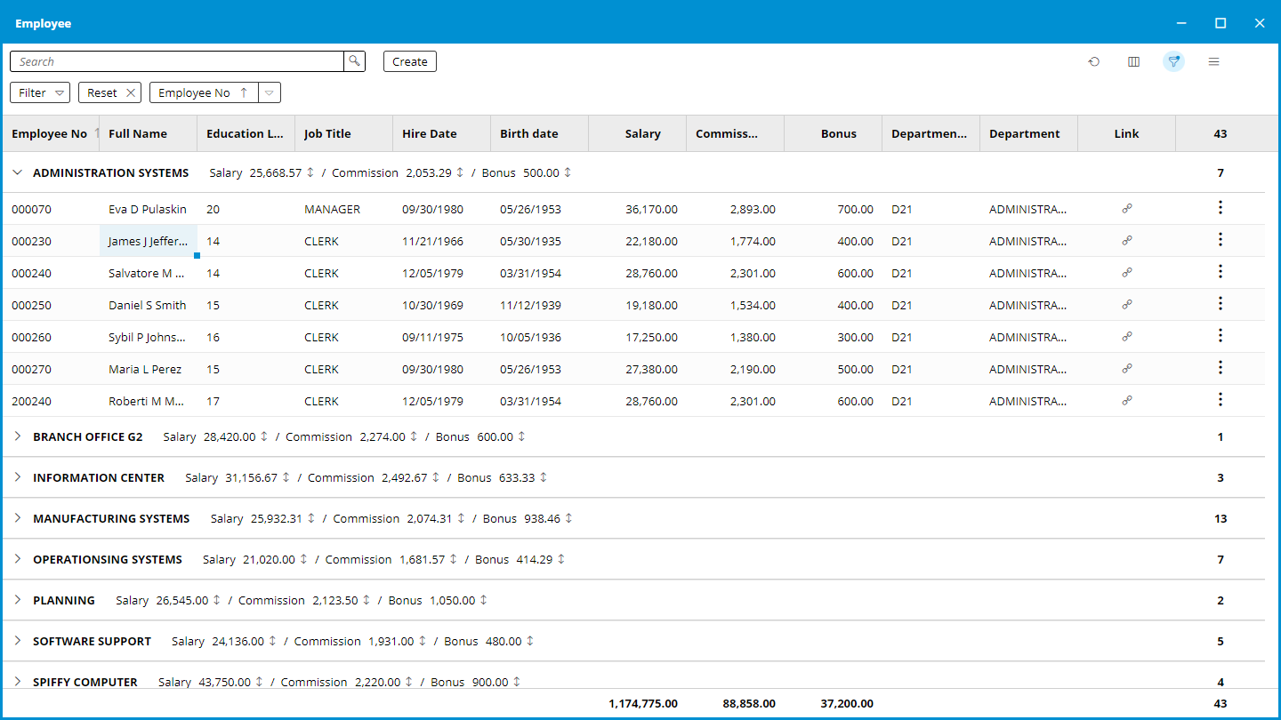
Grouping
To gain a further understanding of the salary structure in the company, we can group the data - for instance, on the "Department" and by right-clicking on the "Salary" column requesting the average salary per department.
Gain further understanding of the salary structure by grouping.
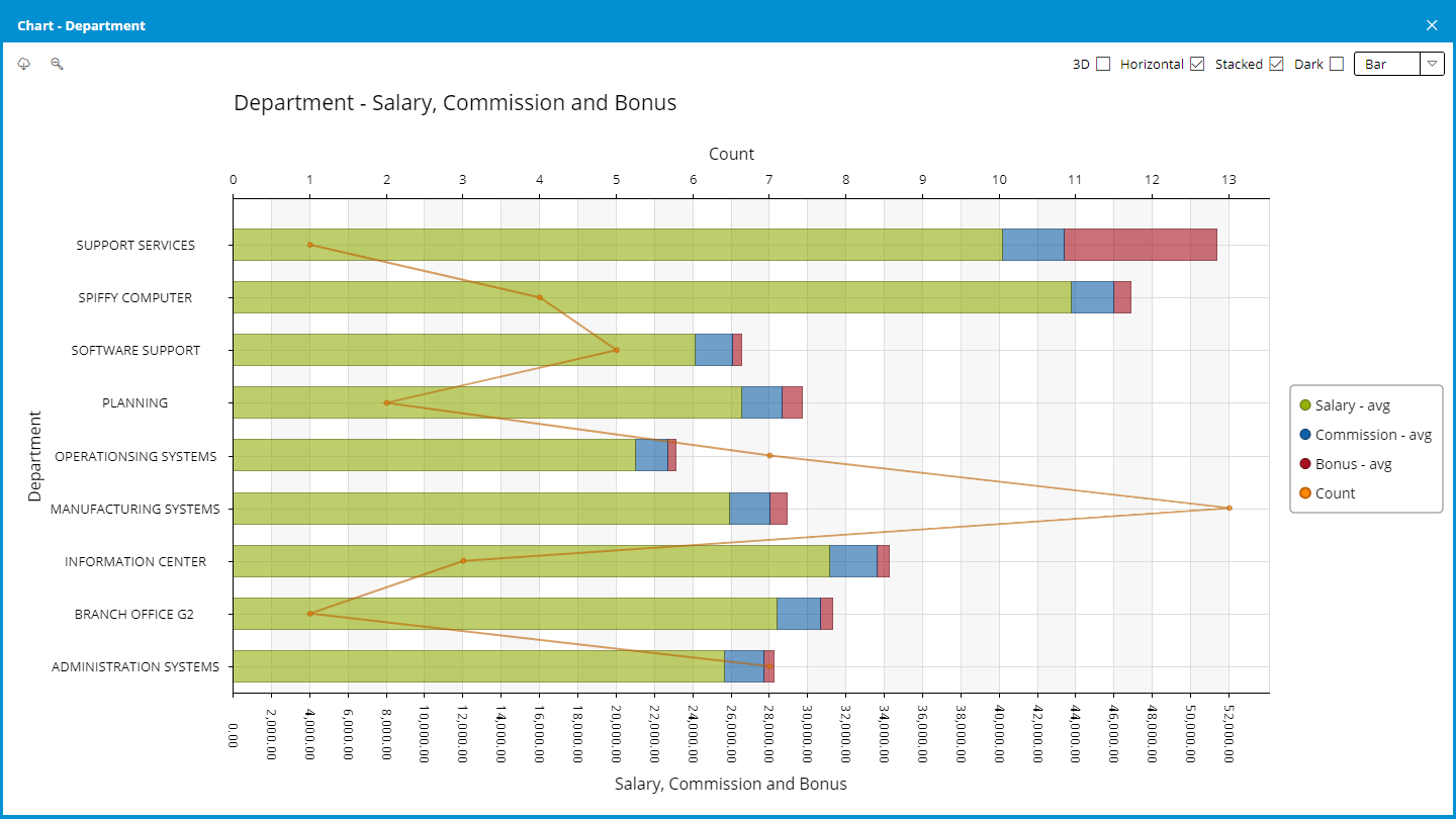
Charting
It's possible to present the data visually in different types of charts.
Line
Bar - vertical/horizontal and unstacked/stacked
Area - unstacked/stacked
Pie - single y-coordinate
The charts can be shown in 3D and dark colors if needed. Most of the charts can show multiple y-coordinates.
You can create several charts and compare them visually to get a deeper insight. You can, of course, save them as PNG files to use in a PowerPoint.
Get deeper insights through visual data representation.
Filtering
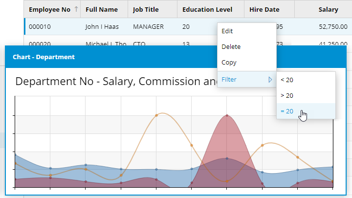
Suppose you require a view over employees receiving bonuses over 500 and having an education level under 18 sorted by name. You can filter by right-clicking on the value 500 in the "Bonus" column and choosing "> 500". The column will now appear as a little drop-down menu over the Grid. You can change or remove the value "500" from there anytime.
You can save the current view for future reference by clicking on the "Filter" drop-down menu and selecting "Save." You should give it a suitable name, like "Upcoming evaluations," and choose whether you want the filter to be used publicly or privately. When you revisit the application, it's easy to retrieve the predefined filter, view its definition, and, if necessary, adjust the selections.
Exporting
You can, of course, export all the data or the current view in a variety of data formats:
Excel - with or without grouping
XML - with or without grouping
CSV
TSV
HTML - with or without grouping
You even get nicely formatted column headings and optional groupings in the Excel and HTML formats.
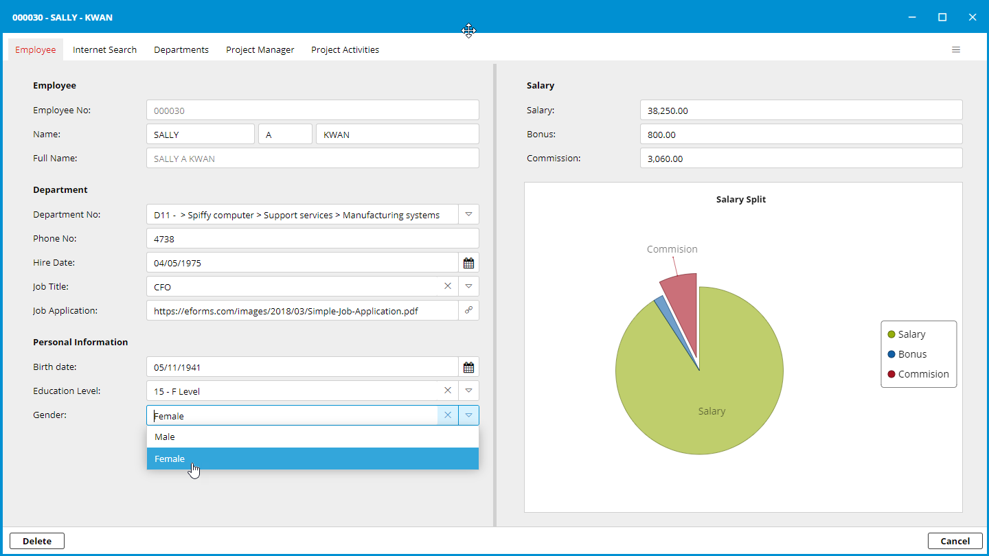
2. Data in forms
When you double-click on a row in the employee Grid, the Form will open as a new tab with the employee's name at the top. This feature lets you work with several employees simultaneously and compare the information.
By right-clicking on the tab and choosing to compare with another tab, the forms will be shown in two windows and automatically arranged side by side. With these features, you can quickly locate and compare different Grids and Forms, allowing quick data processing in the daily work.
Tabs in the Form
The Form can consist of several tabs. The content in the first tab will typically be the data from the table we access. The other tabs will show data from related tables. It could be a list of departments and projects the employee manages and activities in which the employee has been involved.
The Form shows a variety of relevant information.
A tab could also show affiliated data - like Google Maps or a search on Bing. In such cases, the displayed data have a looser connection to the primary data, if any. It could represent a search the user should make in a browser during the data registration process.
The fields can be organized in groups, and the user can be further assisted by applying validation and search features, if possible, to the fields. It's also possible to store data or link to data - that are not character-based - such as images, PDF files, and Office documents.
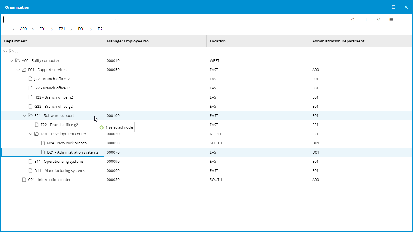
3. Data in Tree Structures
Tree Structure lists are relevant when presenting data on multiple levels, like organization diagrams, project plans, and menu structures. For example, the tree structure could help you visualize the hierarchy of the departments in the organization. It's even possible to use drag-and-drop to adjust the hierarchy data.
With drag-and-drop can, the hierarchy be adjusted.
A right-click and Edit will open the department data in a Form. The Form will show tabs with related data - like the department's employees and current projects.
A double-click on one of the employees brings us back to the employee Form, including all the useful tabs with related data. It's just like the "Rubiks Cube", where you can turn and turn - to get different constellations.
It's all about the data and the relations between the data - We call it the Data Model.
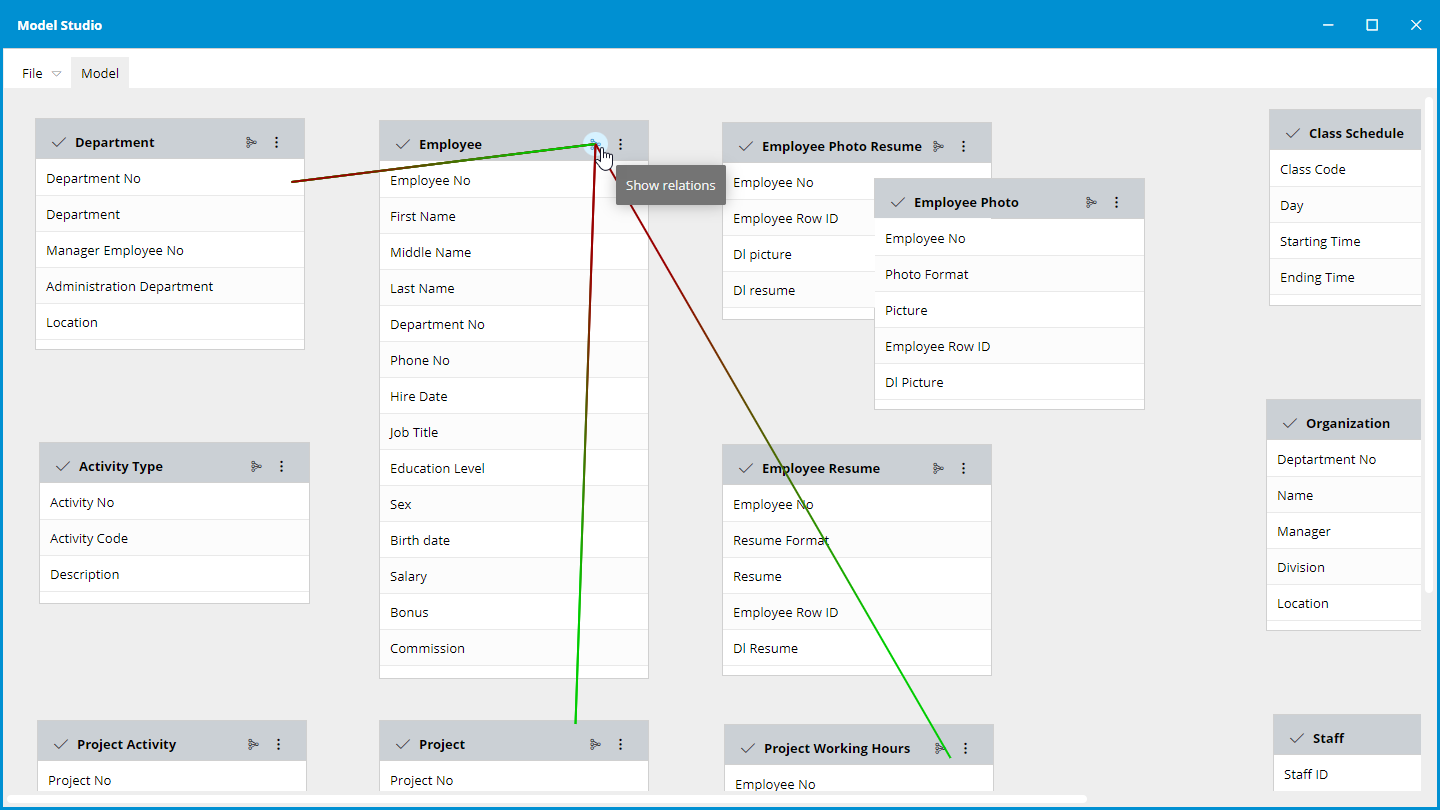
Data Model
When opening the Data Model, every table is visualized as small boxes showing some or all the columns. They are called Entities. Besides the table definitions, they contain all information about presentation, relation, validation, and limitation for the table.
The Data Model provides a comprehensive representation of the entire system
Relations between the tables can be shown by clicking on the relation icon. For example, the Employee table relates to the Department, Project, and Working Hours tables. Likewise, the Department table relates to the Employee and the Project tables.
In this way, everything is joined together.
When editing the Employee table definition, we should focus on the most essential tabs:
Columns
Relations
Grids
Forms
Columns
This tab shows every column definition in the table. You can add, remove, rename, change, or rearrange the columns. The most common changes are made to the following definitions:
Title - language-depending label
UI Type - UI extensions to the Type
Read-Only - true/false
Mandatory - true/false
Title Column - true/false
The definitions and translations will be defaulted in the Grid and Form definition.
Relations
This tab shows the relation between the tables in the data model. There are four different ways to connect the tables:
one-to-many
many-to-one
many to many
one-to-one
A Connection is established by selecting corresponding columns in both tables. Changes made to a connection will also take effect in the related table when applying the definition to the data model.
Grids
This tab shows the columns in the current table and every related table - grouped by table name. It's essential to have all the relevant columns included in the Grid - so the user can search, sort, filter, group, and chart any information.
You can define columns that should be shown preselected, shown by selection, or hidden for the user. Likewise, you can prearrange the columns and set a default sorting.
You also define whether the Grid should behave like a spreadsheet with multiple selections, editing, copying/pasting, and whether the Form should open as a new tab or as a window. Furthermore, should the Grid support functions like Grouping, Summarizing, Charting, Importing, and Exporting
Forms
This tab shows the Form with every available column and table listed on the right side - and the composition of the Form on the left side.
The Forms are designed by dragging columns from the right side into the Form - and arranging the order of the fields. The grouping of fields and division into sections is done in the Form structure on the left side.
Related tables can be shown in tabs by dragging them from the right side into the Form structure on the left side. They can be shown at the top as a tab or in a section as a Grid.
So, you just "glue" these Grids and Forms together to fit your purpose.
Build a new Data Model
It's easy to create a new data model, and if you follow the task list below, you will have a model in 5 minutes:
Start "Model Studio"
Click "File" -> "New"
Provide a new library name the model can use - like "CORPDEMO"
Accept default permissions - because we have no intention of creating or altering tables right now.
Press "Save" - and give it a name - like "CORPDEMO"
Import definition from existing files
Now, we have an empty model. Instead of manually defining the tables, it's possible to import the definitions from an existing library:
Click "File" -> "Import" -> "Library" and select a database library - like "COPRDATA"
The definition of all the files is imported into the model.
Click "File" -> "Organize" -> "Name" to find a relevant table - like "Employee"
Double-click on the table to "Edit" the definition.
Go directly to the "Grids" tab and mark every column as part of the Grid.
Click on the tab "Grid" on the right side of the Grid and select useful features like Grouping, Summery, Import, Export, and Chart.
Click "Apply" to include the changes to the Entity definition.
Build a new application
When modifying the definition of the Grid or the Form, you must Build the Entity to make the changes take effect:
Select "Build" in the menu in the upper right corner of the table.
Accept that the definitions are being saved.
Check, if necessary, the build log for any errors during the build process.
Publish the application
It's easy to apply a new application to the menu structure in Portfolio:
Select "Create Menu Entry" in the menu.
Please give it a describing name and select a suitable icon.
Mark the roles that can access the new application.
Remember to refresh the browser to see the recent changes.
In under 5 minutes, a new application has been defined and published for the users to access.
Access all your ERP data
With this approach, you can quickly set up the system to access all the data in your ERP solution - and, at the same time, give the users what they have been asking for for many years.
This Article Summed Up:
Fulfilling User Wishes
Discover how Sitemule Model Studio transforms user feedback into reality, providing a user-friendly experience for accessing and presenting data. From customizable grids to dynamic charts, it's the solution users have longed for.
Streamlined ERP Access
Unlock the potential of your ERP solution with Sitemule Model Studio's rapid application development. From importing existing definitions to creating new models, users can effortlessly access, organize, and publish ERP data, meeting long-standing user demands promptly.
Empowering Data Management
Model Studio Unveils Versatile Data Presentation Explore Sitemule Architect's Model Studio and its innovative data presentation features. From flexible grid arrangements to detailed forms and hierarchical tree structures, users gain unprecedented control, ensuring efficient data processing and insightful visualizations.
Martin Hecht Olsen, CEO
+45 40 11 77 11
mho@system-method.com
All our software solutions are especially developed for the IBM hardware platforms; AS/400, iSeries, i5, System i and Power Systems.
The supported operating systems are; OS/400, i5/OS and IBM i.