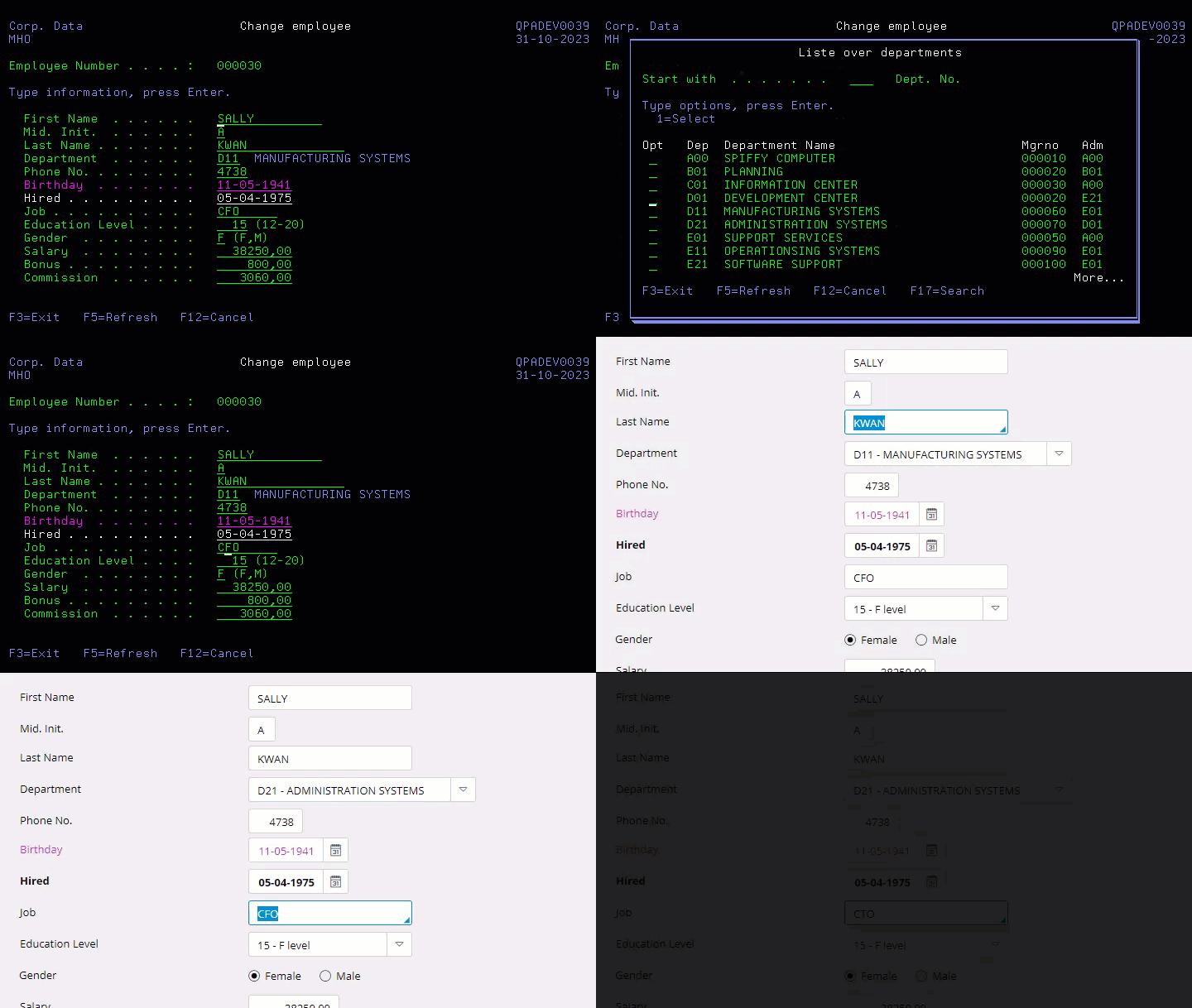
Are you avoiding the black and green elephant in the room?
You probably don't see it because it has been there for decades, and the users have given up complaining about the lack of functionality and usability.
You probably don't see it because it has been there for decades, and the users have given up complaining about the lack of functionality and usability.

It's a giant "elephant" covering over a thousand black and green 5250 screens in your ERP solution.
Not talking about it will not make it go away, and eventually, it will be the main reason to change the ERP platform.
If you genuinely want to continue with your current solution on IBM i - you should read this article or watch the video on YouTube.
They were tailor-made to the workflow. The data was secured by validation of value and database relation.
The design was unified by the Systems Application Architecture (SAA) that IBM introduced in 1987 - and the screens were carefully sized to fit 80 characters by 24 lines.
They were linked together to handle a series of complex operations in one gigantic program and optimized by function keys - and, of course, 100% mouse-free.
Today! The users would say everything!
We should listen carefully to what they tell us – because they are the ones who use the programs daily.
The problem isn't the colors black and green.
In 1987, it was state of the art - but the workflow has changed several times over the years, and the expectations for usability and functionality are much higher today.
The frustration over this situation has been the primary and sometimes the only argument for changing platforms and ERP solutions in the last 20 years.
The IT department often claims it's impossible to change this due to technical and economic reasons and that the users must learn to live with the black and green screens.
What would you say if we once and for all eliminated this problem?
Just by installing IceCap, your applications will immediately get a whole new appearance. IceCap will web-enable your current ERP solution and, in the same process, eliminate most of the limitations in the traditional 5250 emulation.
Portfolio will present all your applications divided into different systems and organized further into tree structures, making it easy to locate desired applications.
The applications open in tabs, thereby providing you with an overview of active applications and ongoing tasks. You can switch from tabs to windows and back again at any time.
Your old ERP solution will hereafter have a modern multi-tasking behavior
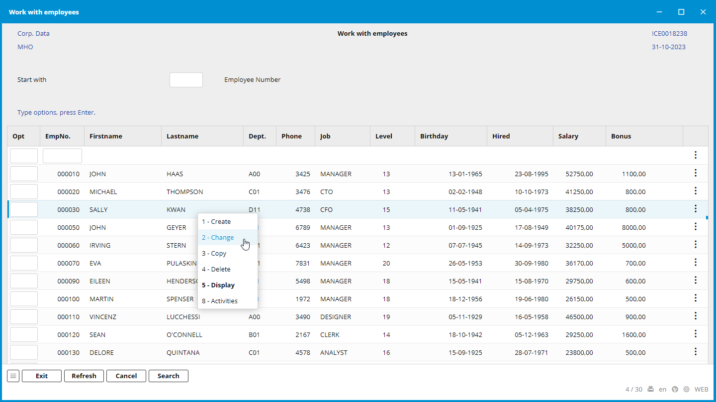
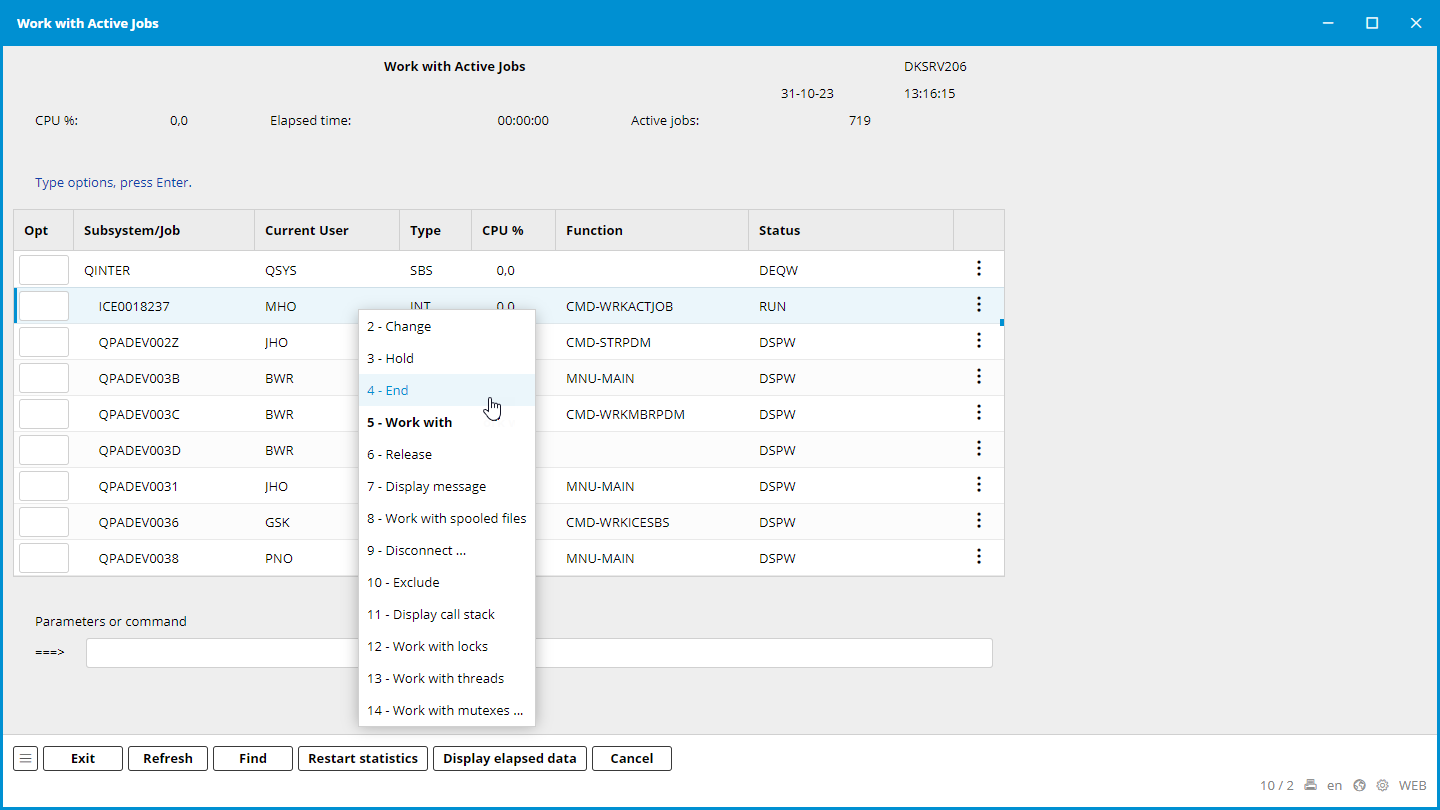
Subfiles are presented in lists, where a right-click shows available options - or, without a mouse, Control Space. The highlighted option is the default option for double-clicking on the row. We have removed the long list of options from the top of the subfile. We have, of course, kept the option field in front of every row, so you still can do different operations on multiple rows.

Function keys are shown as buttons in the panel below - we also hide the F-numbers to be similar to any other modern applications. If you mouse over, the F-number will be shown - and Control-F will give a complete list of F-keys you can pick from.
The new interface supports both mouse and shortcuts. You can even define shortcuts to start often-used programs. Shortcuts are shown as tooltips when you mouse over a button, an icon, or a tab.
We support most of the varieties of 5250 windows that the developers have made over the years. The only difference is that we make genuine windows that can be moved and resized.
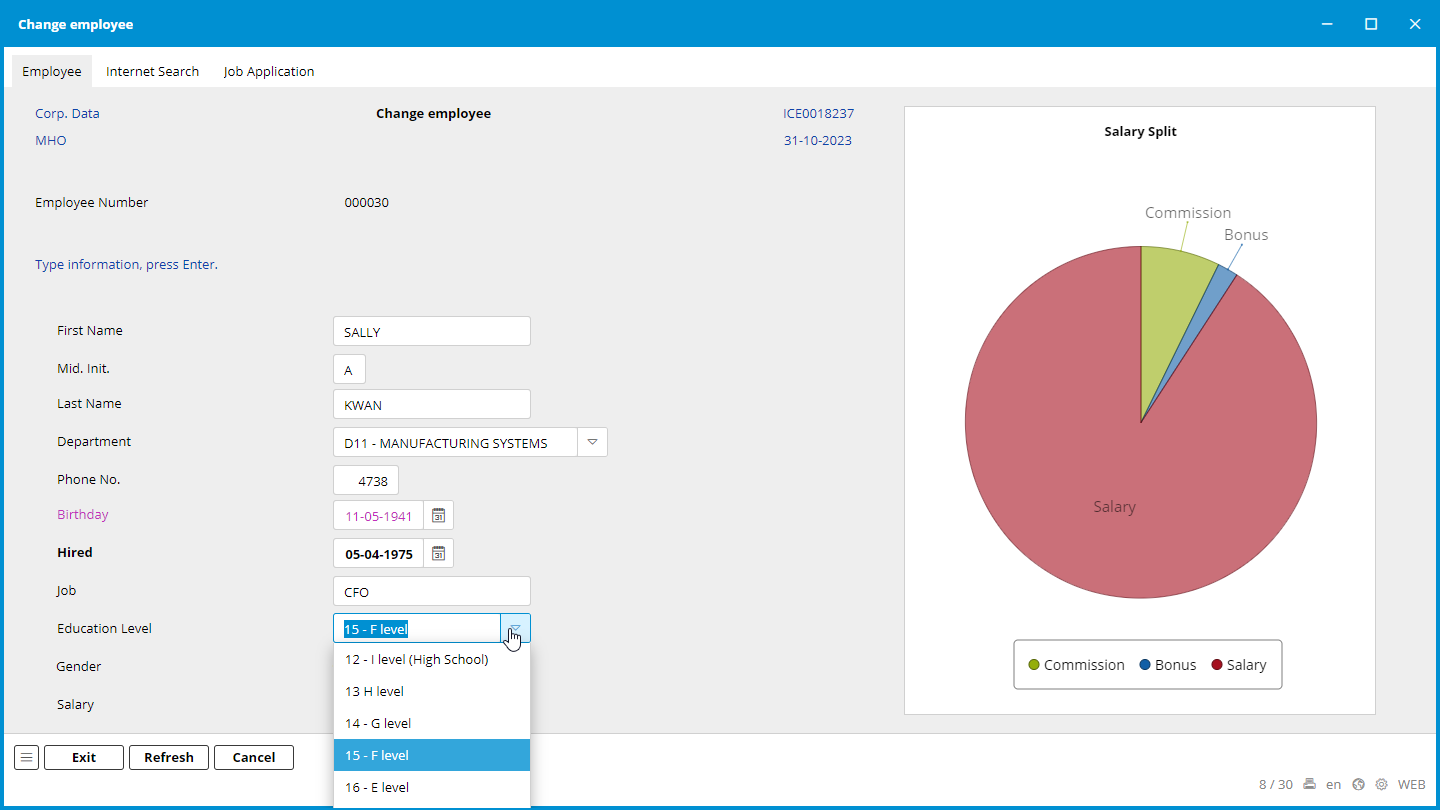
We want to gather as much information for the user as possible. We could, for example, generate a pie chart that visualizes the current employee's salary, commission, and bonus split.
We can add extra tabs to the form for easier access to relevant information from the ERP solution and other sources. For example, the user might want to search and check information about the new employee on the Internet. Reviewing the signed job application when processing the employee's data could also be helpful.
To help users with daily data entry, we provide all the standard tools like combo boxes, check boxes, radio buttons, date pickers - you name it, we got it. We can even show data from several 5250 screens simultaneously- thereby altering the current workflow to be more effective.
You can still use F4-Prompt to search for valid values - but we recommend using our combo box so you don't have to leave the current screen. Sometimes, the combo box can offer more help than the prompt - like a generic search.

We have learned that the user often types the same or nearly the same text data into the form again and again - like names, addresses, and job titles. This can be time-consuming, prone to errors, and often challenging for spelling.
To help the users, we have created the Assist feature. When entering a field with the Assist feature, a blue triangle is shown in the lower right corner - and when typing data, a search will immediately show possible values as suggestions and the number of times it has been used. Please notice it isn't related to the browser, form, or the user - it's a real-time database lookup on the field. If the value isn't shown on the list, the user just types it as they used to - and the value will be adopted. When typing an address, the user typically picks the street name and alters the street number afterward.
If Assist is used on the company name, the users can avoid creating duplicates because they will be aware of existing customers with similar company names.
Assist is more than just a text search - it can combine several fields in the search criteria - for example, limit the search on zip codes to the chosen region, state, or country.
Even the screens in the "IBM i" operating system are transformed because they comply with the SAA standard.
Sorry, IBM - eventually, somebody had to do it!

We are not changing anything in the operating system or your ERP solution - it's only the presentation. As we like to call it, "Integration on the glass."
We don't need the source - we are virtually placed between the program and browser - and secured inside the thick walls of "IBM i."
We could set up the Assist to help fill in the name of the job queue and the library it exists in. When typing, the suggested values decrease until one is selected - and likewise for the library name. When changing the library name, the possible values for the job queue also change. The two fields have a common binding as long as they are found on concurrent lines.
We defined a rule to activate Assist every time the labels "Job queue" or "Library" are shown on the screen. By default, the rule will cover every screen in the entire system and can even be activated multiple times on the same screen, showing relevant values as suggestions.
In a single definition, we can provide "IBM i" with the F4-prompt on the library name - something we have been missing for the last 36 years
The rules are written in RPG, and the database is accessed with SQL. It's, therefore, easy to learn - and we deliver IceCap with a complete demo environment where you can see how it's done and try it out.
IceCap can present your solution with three different versions of appearance:
All the good stuff I have described is, of course, available in every version.
Portfolio can adopt the menu structure from your ERP Solution
We deliver a small RPG program that can easily be modified and integrated with your menu system, presenting it as a tree structure in Portfolio. Likewise, we also provide a program that shows the complete menu system of "IBM i." You can, of course, always add your programs and commands manually.
It's not just the workflow that has changed over the years. Often, we can see that users have tried to register information that didn't exist when the programs were developed. They have used fields that were not in use or no longer relevant - and sometimes, they even changed the purpose of other fields. The original field labels became misleading, and field values also needed to be validated - and even worse, the lack of documentation was handled by legacy stories between the users.
With IceCap, you can easily correct this problem and change the field label so it won't be misleading. You can define rules validating the data - even showing possible values in a combo box. For example, we could change a field label from "Education Level" to "Salary Level." The validation of this field was originally just a numeric value in the range of 16 to 20. So, the combo box is something we added in the definition as an explanation for the user. We could easily adjust it to fit a new purpose.
Many companies have undergone globalization over the last 30 years, requiring the ERP Solution to be multilanguage. Some solutions can't fulfill that requirement. But as I described before, you can easily change the labels and, at the same time, translate them as well. You can even decide if the translation is related to the screen or can be used in the entire system.
Many applications can embed other web applications like IceCap as a window and address it with key values in a query string - just like we do in IceCap. With IceCap, it's possible to script through menus and programs into a specific 5250 screen, providing a fantastic opportunity to show and even update relevant data on "IBM i" from third-party software.
This technique enables us to make workflows that combine selected screens from 5250 programs and different third-party software.
It's also possible to create a genuine web application with Sitemule Model Studio and replace the fixed subfile in a 5250 program with a very flexible web application and gaining many valuable features. And, by keeping the original data entry screen with all the business logic, it's possible to get the best of two worlds with a minor effort.
Can you imagine all the usability your system would gain if this were done to all the programs?
Just to recap what IceCap and Portfolio do
And most importantly, it shows results within the first week.
I hope that this article convinced you that IceCap can remove every issue the users may have had with the "black and green" screens over the years - and you can agree with me that the elephant has left the room.
Hopefully, I have inspired you to do the same for your users and show them that "IBM i" is still alive and kicking - and still relevant.
Discover how Sitemule Model Studio transforms user feedback into reality, providing a user-friendly experience for accessing and presenting data. From customizable grids to dynamic charts, it's the solution users have longed for.
Unlock the potential of your ERP solution with Sitemule Model Studio's rapid application development. From importing existing definitions to creating new models, users can effortlessly access, organize, and publish ERP data, meeting long-standing user demands promptly.
Model Studio Unveils Versatile Data Presentation Explore Sitemule Architect's Model Studio and its innovative data presentation features. From flexible grid arrangements to detailed forms and hierarchical tree structures, users gain unprecedented control, ensuring efficient data processing and insightful visualizations.
All our software solutions are especially developed for the IBM hardware platforms; AS/400, iSeries, i5, System i and Power Systems.
The supported operating systems are; OS/400, i5/OS and IBM i.